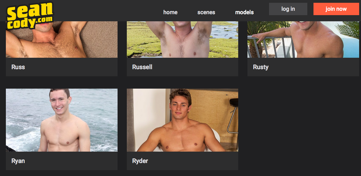
Sean Cody Just Redesigned Their Entire Site, And I Hate It
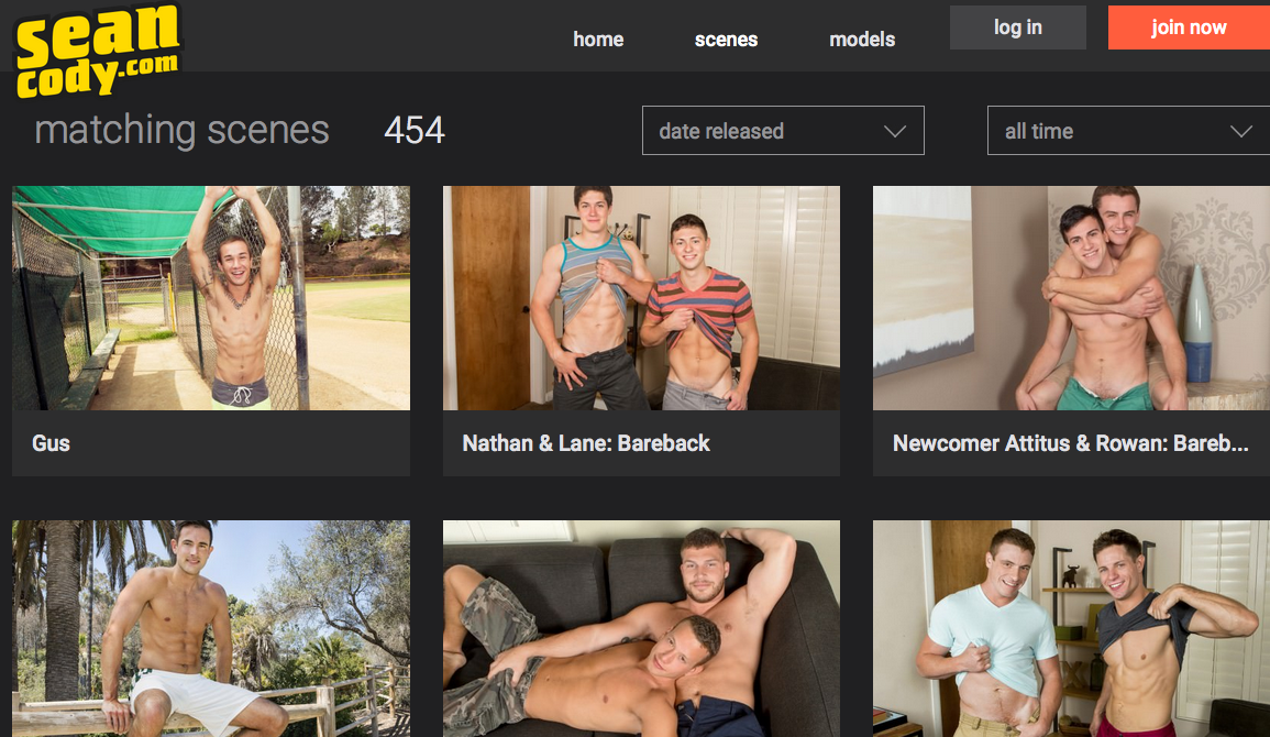
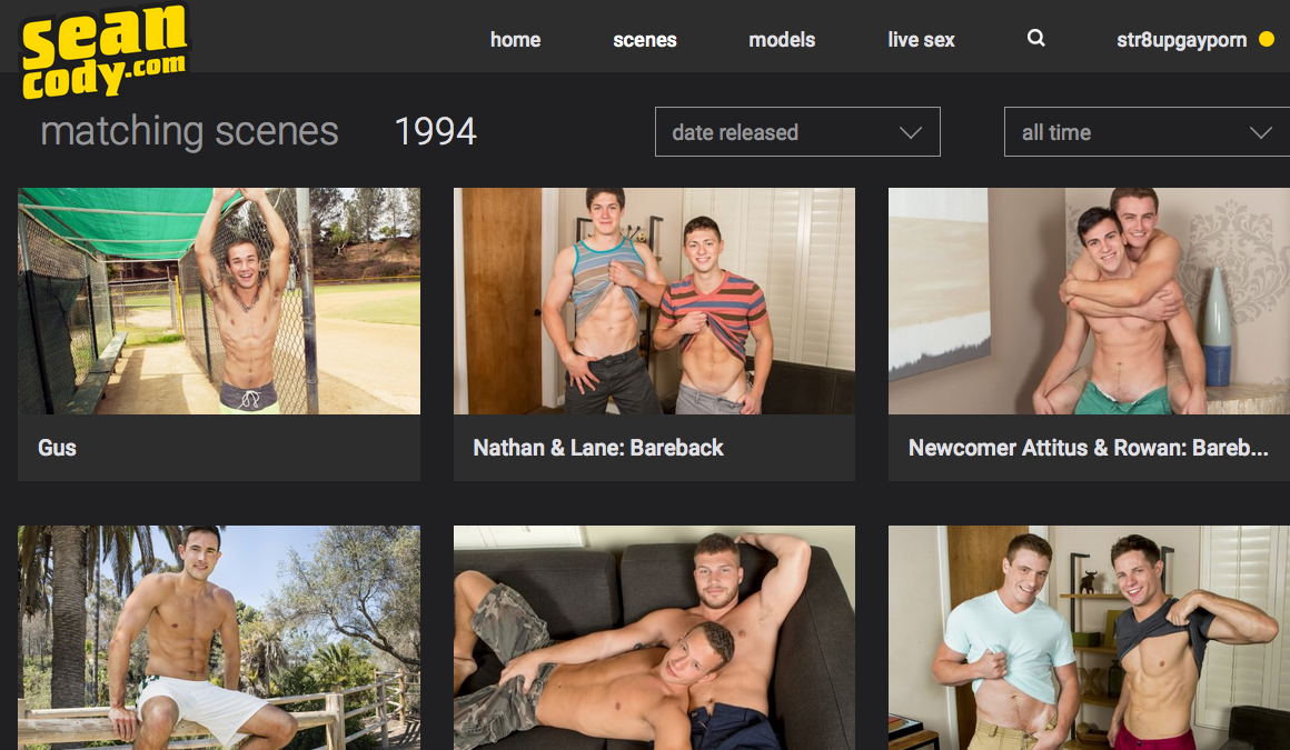
Whatever happened to “if it ain’t broke, don’t fix it”? Sean Cody just redesigned their entire website, and it’s not good. There are nearly 2,000 videos in the Sean Cody library, but if you look at the homepage (as capped above), only the most recent 454 videos will show up. Once you’re logged in as a member, all of the older videos (over 1,500 more) do appear.
This sucks for non-members who want to see all of the content available to them if they join. Plus, given that the majority of Sean Cody’s best content is from over two years ago, you’d think they would want to leave previews of the older content up! Guess not.
The worst aspect of the redesign (which is no doubt another result of the MindGeek acquisition) is the model search function. Before, you’d use the handy drop down box where all the models’ names would be, and you’d simply click on the one you wanted. Now, it’s literally a four step process.
First, you have to click on a “models” link at the top of the page, which then takes you to a “most popular” page.
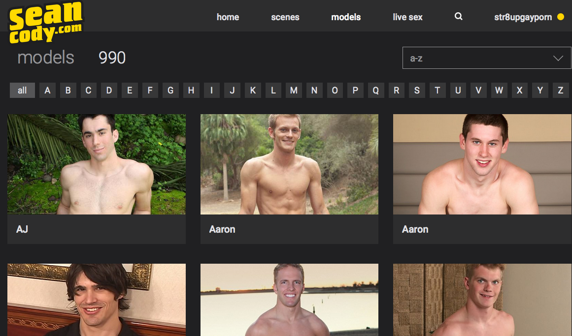
Then, you have to select “a-z” from the drop down, and it takes you to another page, obviously starting with “a.”
Then, if you want to look up, say, “Rylan,” you have to click the “r.”
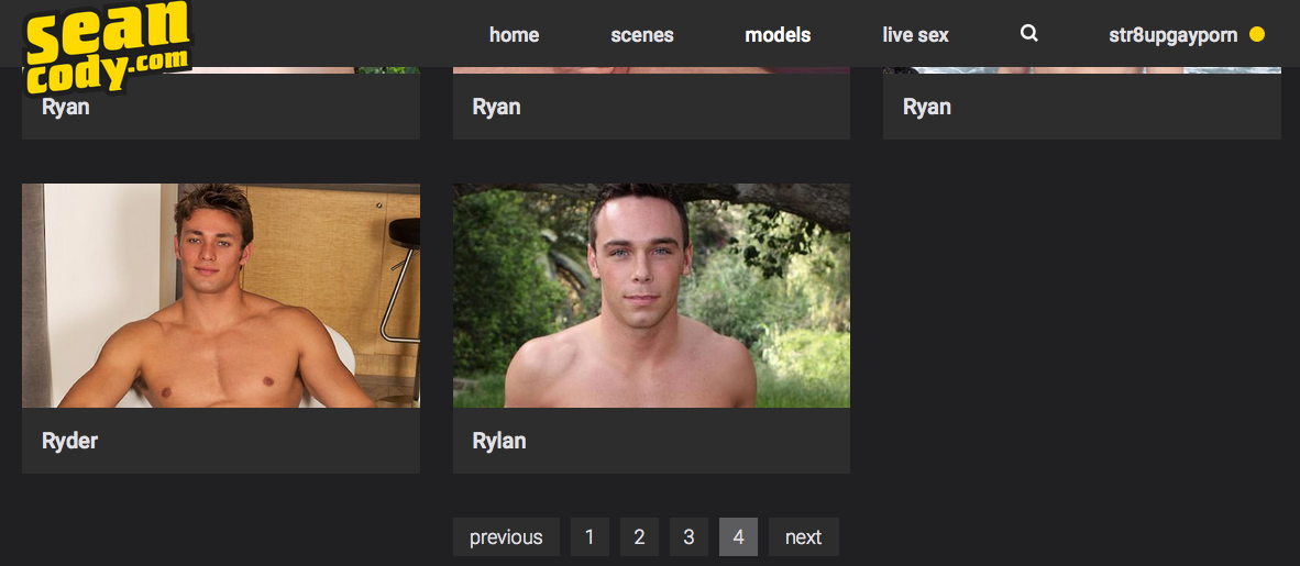
AND THEN? Once you get to the “r” page, you still have to click through the numbered pages at the bottom to reach Rylan. Ugh.
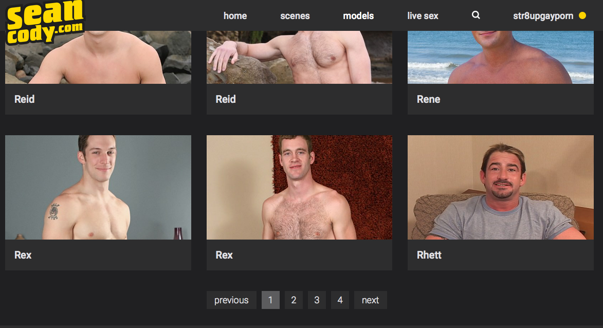 You have to guesstimate where Rylan will show up based on the spelling of his name. At first I thought page 3, but of course, he was all the way on page 4.
Long story short, not being able to pull up a model’s profile via one click is a huge waste of time.
Oh, and if you’re not logged in as a member, an older model like Rylan (and all of his scenes) won’t even show up. (And FYI: models like Ethan and Patrick and Jake and even Calvin(!) don’t show up either if you’re not logged in.)
The single “r” page ends with Ryder. Sorry, Rylan.
For consumers looking for visually pleasing images on the front page, this might be fine. But for a blogger who’s constantly referring to classic or even slightly older Sean Cody scenes, filmographies, and model stats, this is a nightmare.
Poke around on the site and let me know what you think (there are new sharing options on the trailer pages and a new photo gallery interface; if you’re a member, there are new video players and download tools). For those of you with nearly 10 years of experience navigating around SeanCody.com, what do you think? Awful? Great? Maybe it’ll grow on you?


